Corporate Identity Design: 5 Common Traits of Successful Brands

What Is Corporate Identity and Why Does Everyone Get It Wrong?
Getting a logo designed, picking a couple of colors, and printing business cards. That's what most business owners think when they hear corporate identity. But the reality runs much deeper. Corporate identity encompasses not just a brand's visual language, but the attitude, promise, and character behind that language. I think the real problem starts right here: treating identity as purely an aesthetic matter.
When I look at successful brands, I notice something they all share. They all have a consistent story. This story doesn't just appear on their website—it shows up in customer service, product packaging, even in the signature at the bottom of employee emails. That's exactly where the answer lies to why having a corporate identity matters so much for any brand.
First Trait: Visual Consistency at an Obsessive Level
Successful brands maintain almost obsessive visual consistency. They won't change even a single hex code of a color tone. They prepare pages upon pages of guidelines for logo usage.

But let's pause here. Consistency doesn't mean boring. Consistency means recognition. When a customer sees your brand's colors, they should be able to remember you without even seeing your logo. Reaching that level takes years, and it's impossible without proper corporate identity work.
Color and Typography Selection
There's tons of material on color psychology, but from what we've seen in practice, most companies end up making strange choices while trying to avoid their competitors' colors. When everyone gravitates toward blue because "blue conveys trust," blue stops being a differentiating factor. The real challenge is owning whatever color you choose.
Second Trait: The Voice Never Wavers
Think of your brand as a person. How would they speak? Formal or casual? Witty or serious? Every successful brand has answered this question clearly.
From social media posts to customer complaint emails, from ad copy to product descriptions—the same tone of voice is maintained everywhere. The concept known as "brand voice" in brand management literature is probably the most neglected part of corporate identity.
Clients usually miss this point: The logo and colors are ready, but they're using a jokey tone on Instagram, sounding like a robot on their website, and being defensive in customer service. This inconsistency erodes trust.
Is a Logo Enough for Corporate Identity on Its Own?
No. Absolutely not. Why am I saying this so definitively? Because the vast majority of projects that start with "we just need a logo" come back a few months later with "this logo isn't working."
A logo is just one component of corporate identity. What are the others?
- Color palette and usage rules
- Typography family (heading and body fonts)
- Visual language and photography style
- Icon set and graphic elements
- Tone of voice and communication guidelines
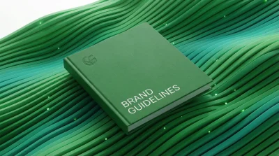
Without a brand guidelines document covering all of these, different departments do different things. Marketing pulls one way, sales pulls another. The result: A scattered perception.
Third Trait: Discipline Within Flexibility
It sounds like a paradox, but it isn't. Successful brands are both extremely disciplined and flexible. From what we've observed, the best corporate identity systems offer "frameworks" rather than "rules."

What does this mean? For instance, there's a minimum clear space rule for logo usage, but creative freedom is allowed as long as you stay within that rule. Colors are defined, but there's flexibility for transitions between tones. Typography is fixed, but adaptation guides exist for different platforms.
The Digital vs. Print Divide
A mistake we see in most projects: Identity designed for print materials gets transferred to digital as-is. But screens and paper are different. This detail, which should be considered alongside questions about what an ideal website should look like in 2026, usually gets skipped.
Fourth Trait: Story Is at the Center of Everything
Everyone talks about this, but does it actually work? "Storytelling" has been used so much in the marketing world that it's become a cliché. But when I look at successful brands, I see that story really is central. Being a cliché doesn't mean it's wrong.
Story doesn't just mean your founding tale. It's why your brand exists, what it wants to change, who it speaks to. The answers to these questions form the foundation of corporate identity design.
A brand is what people say about you when you're not in the room.- Jeff Bezos, Forbes
I think this definition sums up the whole matter. Corporate identity works to shape the impression that remains in people's minds when you're not in that room.
Fifth Trait: Long-Term Thinking
In 2026, there are still brands chasing "trends." Gradients are hot this year, so everyone does gradients. Minimalism is in next year, so suddenly the logo gets simplified.
Successful brands don't work like this. They build a corporate identity system that will still be valid 10-15 years from now. Sure, minor updates happen, but the core DNA stays intact. Even questions about creating attention-grabbing ad campaigns should be evaluated with this long-term perspective.
When Is Rebranding Actually Necessary?
Unless there's a company merger, target audience shift, or serious reputation crisis, radical changes are risky. Rebranding projects are expensive and outcomes are uncertain. Evolving the existing identity is usually smarter.
So What Should Small Businesses Do?
When budgets are tight, getting professional brand guidelines made might seem like a luxury. But let me tell you: If it's not done right at the start, fixing it later costs far more.
At minimum, you should have:
- Professional logo (in vector format)
- Three main colors and where to use them
- One heading font, one body font
- Basic communication tone established
Even this much prevents inconsistency. It can be expanded later.
Instead of a Final Word, a Question
If you were to describe your brand as a person, what kind of person would they be? If you can't answer this question clearly, your corporate identity work is incomplete. The logo might be beautiful, the colors might be pleasant, but if the character is unclear, perception remains unclear too.
When we look at the five common traits of successful brands, we see that each one requires strategic thinking as much as technical skill. This strategic perspective becomes decisive even in building social media communities. Whether you're working with any agency or handling things in-house, I'd recommend using these five traits as a checklist. If something's missing, start there.