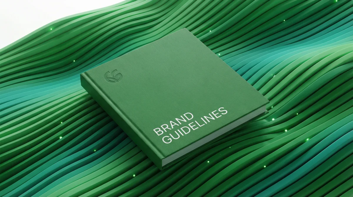
What is a Corporate Identity Guide?
What Does a Corporate Identity Guide Actually Do?
A corporate identity guide brings together a brand's visual language under one roof. And honestly? It's probably the most neglected document in most companies—yet the one they need most desperately.
Think about it this way: You've got a logo. You've got a color palette. You've got fonts. But who's using them? Where? How? That's where the chaos begins, and that's exactly what a brand guide is supposed to prevent.
Here's what we see constantly: A company invests in a brilliant logo design. Six months later, that logo appears stretched on social media, cramped on business cards, and completely off-color on their website. The brand starts looking like it has multiple personalities. What is a corporate identity guide—the answer lies right here. It's your guarantee of consistency.

The Chaos That Unfolds Without One
Let me be blunt: Brands operating without a guide will eventually contradict themselves. It's not a matter of if—it's when.
Your graphic designer leaves? The new hire rummages through old files, adds their own interpretation, and suddenly your brand looks different. You switch agencies? Everything starts from scratch. Hours of meetings explaining what you want. Again.
This isn't just about visuals, though. The importance of corporate identity runs deeper than most people realize. Your customers subconsciously pick up on inconsistency. It erodes trust in ways that are hard to measure but very real to feel.
Problems We Encounter All the Time
Especially in growing companies, these mistakes pop up repeatedly:
- Nobody knows the clear space rules around the logo—sometimes it's suffocating, sometimes it's floating in emptiness
- Color codes render differently across platforms and nobody's checking
- Font families get mixed up, or worse, completely different fonts appear out of nowhere
- Everyone designs according to their personal taste instead of an established visual language
What Do Corporate Identity Guide Examples Look Like?
Corporate identity guide examples typically share certain sections, but here's the thing—not every guide needs to look the same. Some brands put together a 15-page minimalist document. Others produce 100-page detailed manuals with specifications for everything down to the angle of photography lighting.

I think the ideal approach is scaling to your company's size and needs. A startup? Ten pages might be plenty. A multinational corporation? Fifty pages could still leave gaps.
The Core Components
Logo usage rules always come first. Minimum size, protection area, permitted applications, forbidden applications... When you consider how many logo design mistakes happen in the wild, you start to understand why this section is so critical.
Color palette takes the second spot. And I'm not just talking about hex codes. You need Pantone equivalents, CMYK values, even RAL codes if you're doing physical signage. Why? Because digital and print operate on completely different principles. That navy blue that looks perfect on screen can turn into muddy purple on a brochure if you haven't specified the right values.
Typography and Visual Language
I wouldn't be exaggerating if I said font choice determines your brand's tone of voice. Serif or sans-serif? What goes in headlines versus body text? These decisions need to be locked down in the guide, not left to whoever happens to be designing that week.
How Long Does It Take to Create One?
We get this question constantly. The honest answer: it varies. But that's not a cop-out—it's genuinely true.
If you're building brand identity from scratch, including research and strategy, 6-8 weeks is reasonable. If you're documenting an existing identity that's already been established, 2-3 weeks might be enough. The biggest mistake we see is rushing this process. A half-baked guide is almost worse than no guide at all, because it gives people false confidence.
The Wikipedia definition of corporate identity is technically accurate, but in practice, the emotional and strategic dimensions of this work carry far more weight than any textbook description suggests.
What Does This Have to Do With Internal Policies?
I'm going to draw an interesting parallel here. Think about how internal company policies—like housing regulations or employee handbooks—govern how things work inside an organization. A corporate identity guide does the same thing for your brand's external appearance.

Both are rule-setting documents. Both create consistency. The reason I'm making this comparison is that most companies obsess over internal procedures while completely ignoring brand procedures. But here's the thing—every customer touchpoint is more visible than any internal process could ever be.
Digital vs. Print: They're Not the Same
When you study what successful brands have in common, you'll notice they treat digital and print as separate beasts. This distinction needs to exist in your guide too.
On the digital side:
- Responsive logo versions for different screen sizes
- Social media profile photo and cover image templates
- Email signature format (this one causes more arguments than you'd expect)
- Banner and ad creative standards
On the print side, business cards, letterheads, envelopes, and invoices still matter. Yes, even in 2026. Digitalization has accelerated, but physical touchpoints haven't disappeared. In fact, when everything's digital, a well-designed business card stands out more than it did ten years ago.
What Happens After the Guide Is Done?
Here's the trap most companies fall into: They commission a beautiful corporate identity guide, then file it away in some folder and forget it exists. That's like buying a gym membership and never going.
A guide needs to be a living document. When a new social media platform emerges, update it. When your brand tone evolves, revise it. When W3C accessibility standards change, adapt.
Distribution and Training
Sharing a PDF isn't enough. Especially in larger teams, employees need actual training. New hires should learn about it during onboarding. Vendors and agencies need access.
One successful approach we've seen is presenting the guide as an interactive web page. That way, everyone can always access the current version without hunting through email attachments or asking "which file is the latest one?"
Let's Talk About Cost
I'll be transparent here. A professional corporate identity guide isn't cheap. But you need to view the cost as an investment.
Consider what inconsistent brand usage actually costs: lost customer trust, reprints due to wrong specifications, hours spent re-explaining your brand to every new partner or vendor. Add all that up, and it quickly exceeds what a proper guide would have cost.
If you want to create attention-grabbing advertising, you first need a solid brand foundation. Otherwise, your campaigns will feel disconnected from your brand—and disconnected advertising confuses customers more than it converts them.
A Question Instead of a Conclusion
Does your company have a corporate identity guide right now? If yes, when was it last updated?
Your answers to those two questions reveal a lot about your brand management. Creating a guide isn't the finish line—it's the starting point. The real work is implementing it and keeping it alive. Brands that manage to do this consistently stay ahead of their competitors. Those that don't? They spend years wondering why their marketing feels scattered and their customers seem confused.