How to Design Mailings? Clickable Emails in 7 Steps
Why Is Email Design So Frustratingly Difficult?
Let me be honest with you: email design is far more complicated than anyone wants to admit. I've watched countless marketers assume they can just shrink their Instagram graphic and slap it into a newsletter. Spoiler alert—that doesn't work. Creating emails that land in spam folders, break on mobile devices, or get zero clicks requires absolutely no effort. Those happen naturally.
But emails that actually get clicked? Those demand real strategy. I've been writing about digital marketing for years, and here's what I've learned: good email design requires equal parts technical knowledge and empathy. You need to understand what it feels like to be on the receiving end of that inbox notification at 7 AM.
You Can't Design an Email Without Knowing Who's Opening It
This is the step everyone skips. Before you even think about colors or fonts, ask yourself: Who will open this email? Are they checking it at 8 AM with their coffee, or during a lunch break? Are they tapping a phone notification while walking, or sitting at a desk with a full monitor?

These aren't luxury questions—they're essential. Email templates designed without understanding your audience usually end up in the "pretty but useless" category. The gap between B2B and B2C email design is enormous. You simply cannot design a corporate newsletter and an e-commerce flash sale email using the same logic.
Segmentation Does Half the Work
Sending one email design to your entire list stopped working years ago. If you look into bulk email sending methods, you'll see just how dramatically segmentation affects open rates. I think this is where most small businesses lose the game before it even starts.
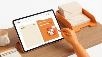
Subject Lines: The Invisible Part of Design
Here's a take that might ruffle some feathers: I believe subject lines should be considered part of email design. Why? Because your beautifully crafted email is invisible if nobody opens it.
A few practical notes:
- 30-50 characters is the sweet spot—anything longer gets cut off on mobile
- Emoji usage depends on your industry, but it does grab attention
- Personalization (like adding first names) consistently boosts open rates
- Urgency phrases like "Last 3 hours!" work, but overuse destroys trust fast
Visual Hierarchy and Email Design Are Inseparable
Now we're getting into actual design territory. The W3C's page structure guidelines were written for web pages, but the core principles translate beautifully to email.
When someone opens an email, where does their eye go first? Top left corner. From there, it moves in an F-shaped pattern. This means your most important message—whether that's a discount percentage or your CTA button—needs to live in that zone. I see designers constantly burying their key message below decorative headers. It drives me crazy.
Single Column or Multi-Column?
Multi-column layouts look elegant on desktop. But here's the reality in 2026: the vast majority of emails are opened on mobile devices. Single-column, vertically-flowing designs are both safer and more readable.

This is where responsive design becomes critical. Email clients are wildly inconsistent with CSS support—Outlook is still using a rendering engine from 2007, if you can believe that. This means inline CSS and simple table structures remain the safest bet.
The Psychology Behind CTA Buttons
"Buy Now," "Learn More," "Discover"... which of these gets more clicks? The answer depends on context, but there are some universal rules worth knowing.
Button size matters more than people think—it needs to be large enough for a thumb tap, minimum 44x44 pixels. Color should contrast sharply with the rest of your email. If your brand palette is black and white, using orange or green for your CTA makes sense. The connection between brand identity design and email design matters too, but don't let consistency kill conversion.
Using a single CTA per email typically outperforms multiple buttons. Giving recipients too many choices triggers decision paralysis. I've seen this happen repeatedly with clients who want to promote five different things in one email.
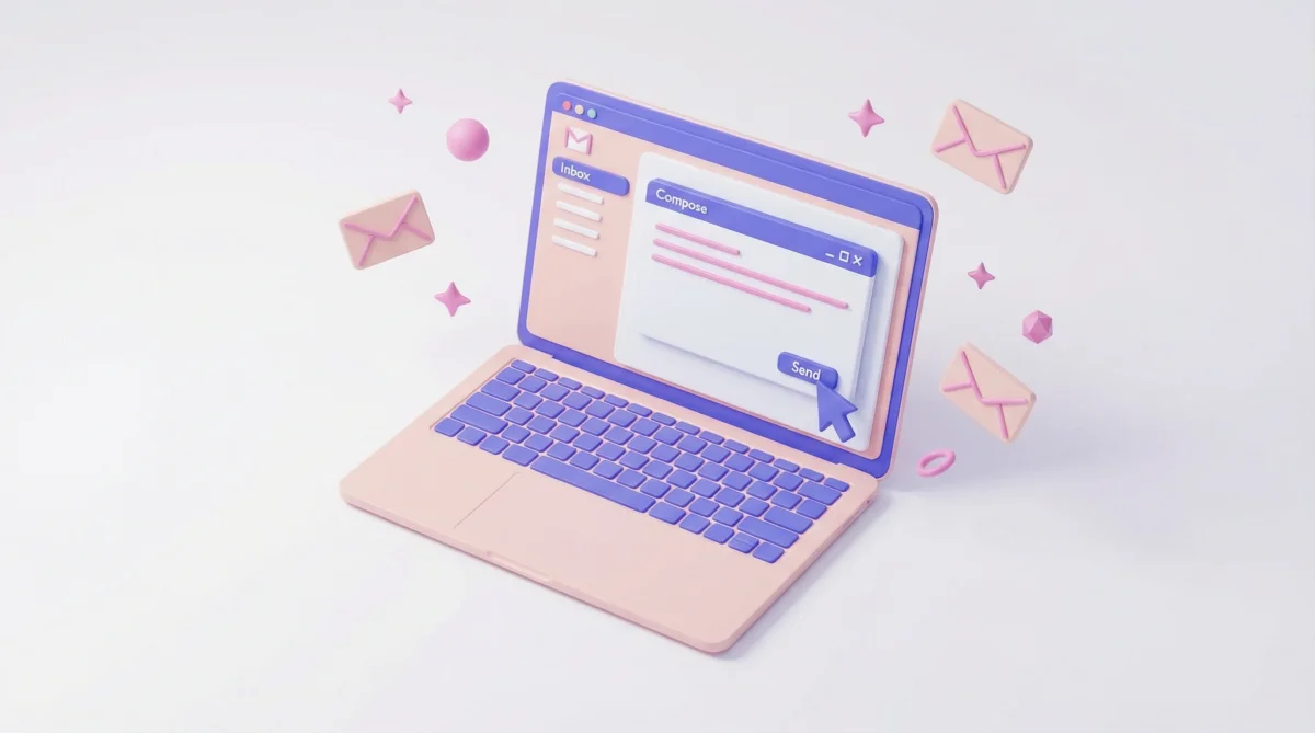
HTML Emails or Plain Text?
This debate refuses to die. Do rich, visual HTML emails convert better, or do simple plain text messages win?
My answer: both have their place. Campaign announcements and product launches require HTML design. But if you want to create a personal feel—like a message from the CEO—plain text feels more genuine. People can tell when they're being marketed to.
A hybrid approach works too: text-heavy designs with minimal visual support. We've seen this approach deliver strong results across various email campaigns.
The Dark Mode Problem
In 2026, you cannot ignore dark mode anymore. A huge portion of users browse with dark themes enabled, and your white-background logo will look terrible on a black backdrop. You need transparent PNG files or dual-version logos. This seems like a small detail until it makes your email look broken to half your audience.
A Real-World Test That Surprised Us
Last year, we ran an A/B test for an e-commerce campaign that yielded interesting results. We created two different email designs for the same promotion: one heavy on visuals, the other minimalist and text-focused. The minimalist version significantly outperformed the visual one in click-through rates. Sometimes less really is more—though I'll admit, the visual version was objectively prettier.
7 Steps to Emails That Actually Get Clicked
Let me distill everything into a practical checklist:
- Audience analysis: Who, when, which device?
- Subject line: Short, curiosity-provoking, no spam trigger words
- Preheader text: Your second chance to support the subject line
- Visual hierarchy: F-pattern, single message focus
- Responsive structure: Think mobile-first
- CTA optimization: One button, contrasting color, action-oriented text
- Testing: Preview across clients, run A/B tests
Don't look at this list and think "that's simple." Each step contains dozens of details. The principles from attention-grabbing ad design apply directly to email too.
Never Send Without Testing
The riskiest move in email design is hitting "send" without testing first. Gmail, Outlook, Apple Mail, Yahoo—each one interprets your email differently. What looks perfect in your design tool might be completely broken in someone's inbox.
Using tools like Litmus to preview across different clients isn't optional—it's mandatory. A/B testing different subject lines and CTA copy should be ongoing, not occasional.
In practice, we've seen tiny changes create massive differences. Switching a button from red to blue can dramatically shift click rates. You won't know until you test.
This Field Doesn't Stand Still
One final thought: email design is not a static discipline. Just like digital advertising tactics evolve constantly, so does email. Technologies like AMP for Email are enabling interactive experiences right inside the inbox—carousels, forms, live content. If you're not paying attention to where this is heading, you're already falling behind.